Sonos
Premise
Sonos Radio offers not only a high-quality streaming platform but also design that facilitates listening effortlessly, endlessly.
Goal
Build a digital home for the Sonos Radio brand that showcases its premier offering as a discovery and listening platform devoted to expanding the experience and importance of music.
Archives, Records, and Power
Founded in 2002, Sonos has been an industry leader in sound system technology for decades. With Sonos Radio comes their organic evolution as curators offering experiential programming that positions the brand as a powerful cultural driver. An immersive library of programming and product—and with it, the power over memory and brand identity.
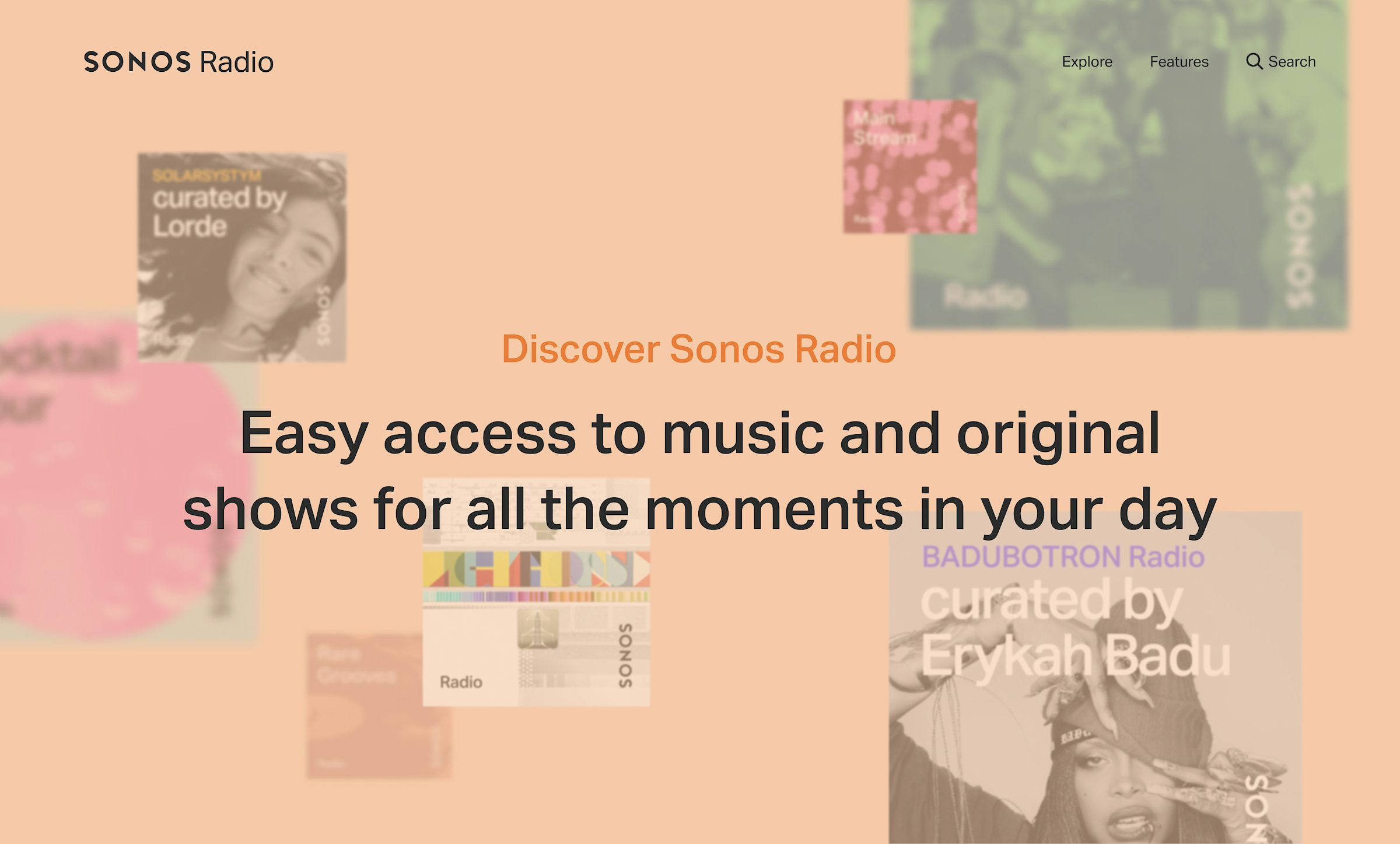
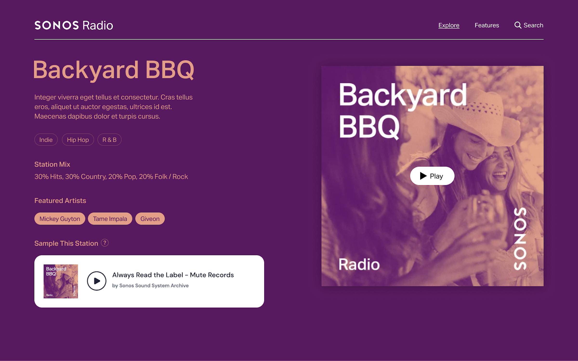
To engage visitors with an immersive experience upon visiting the site, the homepage hero module features a beautiful, clean transition with albums floating in 3D space on a dark background.
Setting the Mood
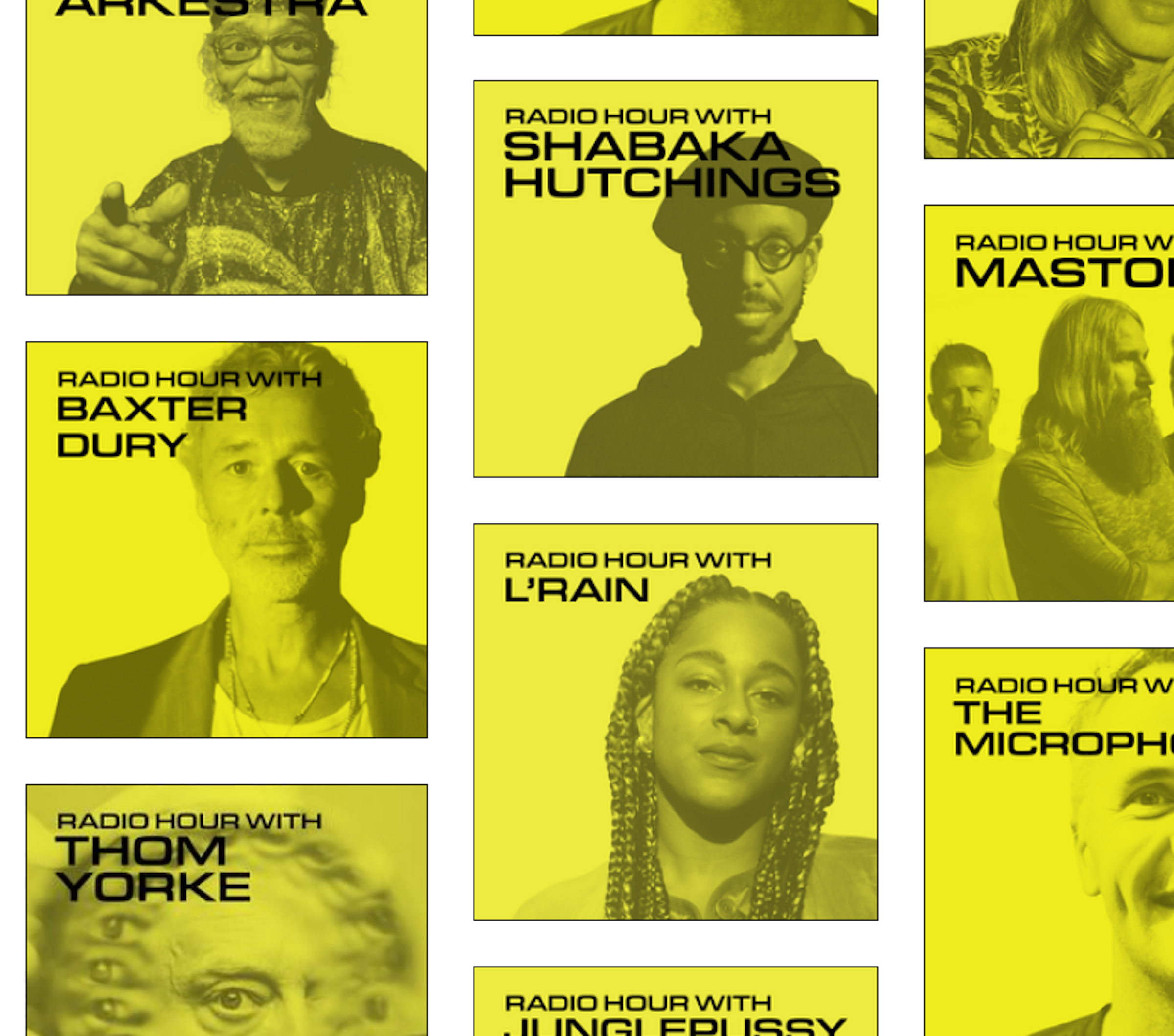
We developed two directions—one that drew from Sonos' existing branding but punched up with more immersive user experience and vibrant, fun colorways, and a second, moodier direction that prioritized discovery to mimic the “record store” appeal. Both directions feature moments that engage users with fun interaction and styling.
Direction A


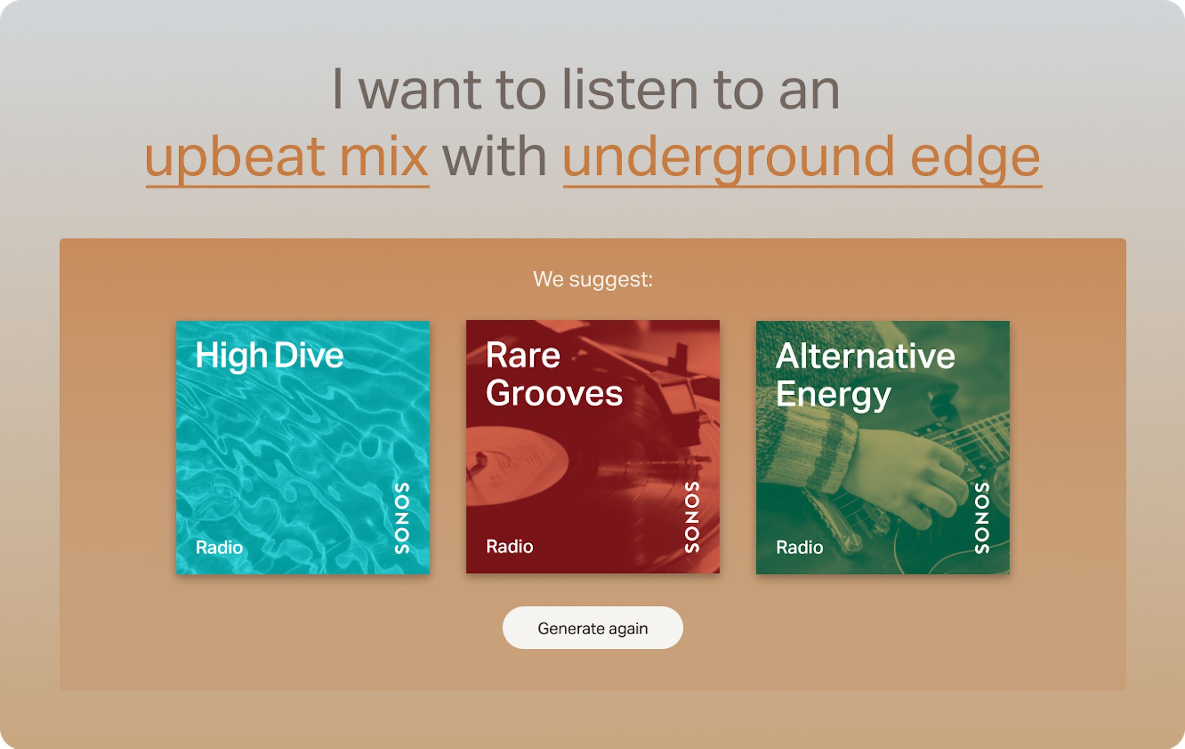
In early versions of Direction A, marquees offered a modern web experience, allowing the user to click and discover possible mood stations.
This early version of our interactive hero moments served as a way to discover new music through mood, color, and images.


Direction B

Compared to direction A, direction B utilized a rich, moody color palette.


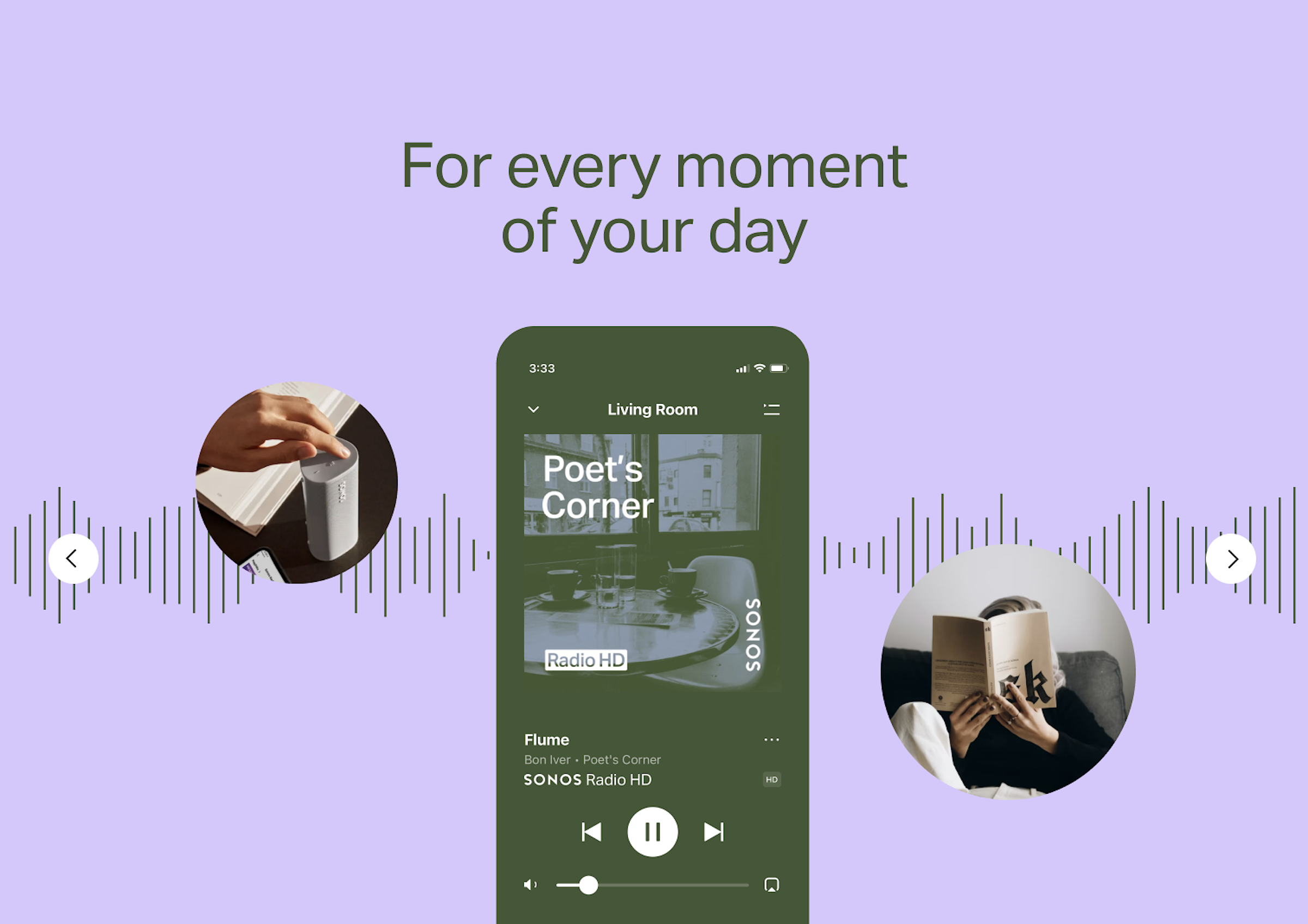
For Every Moment
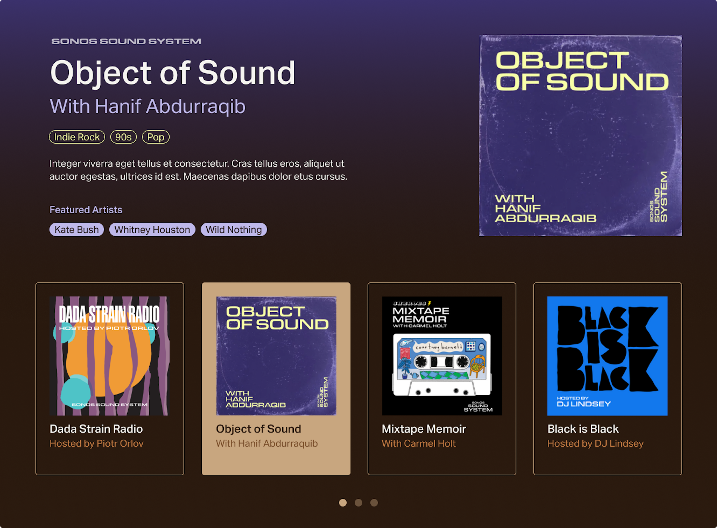
The final web design uses simple development to align with Sonos branding, combined with more immersive, interactive blocks to promote shows and original content.
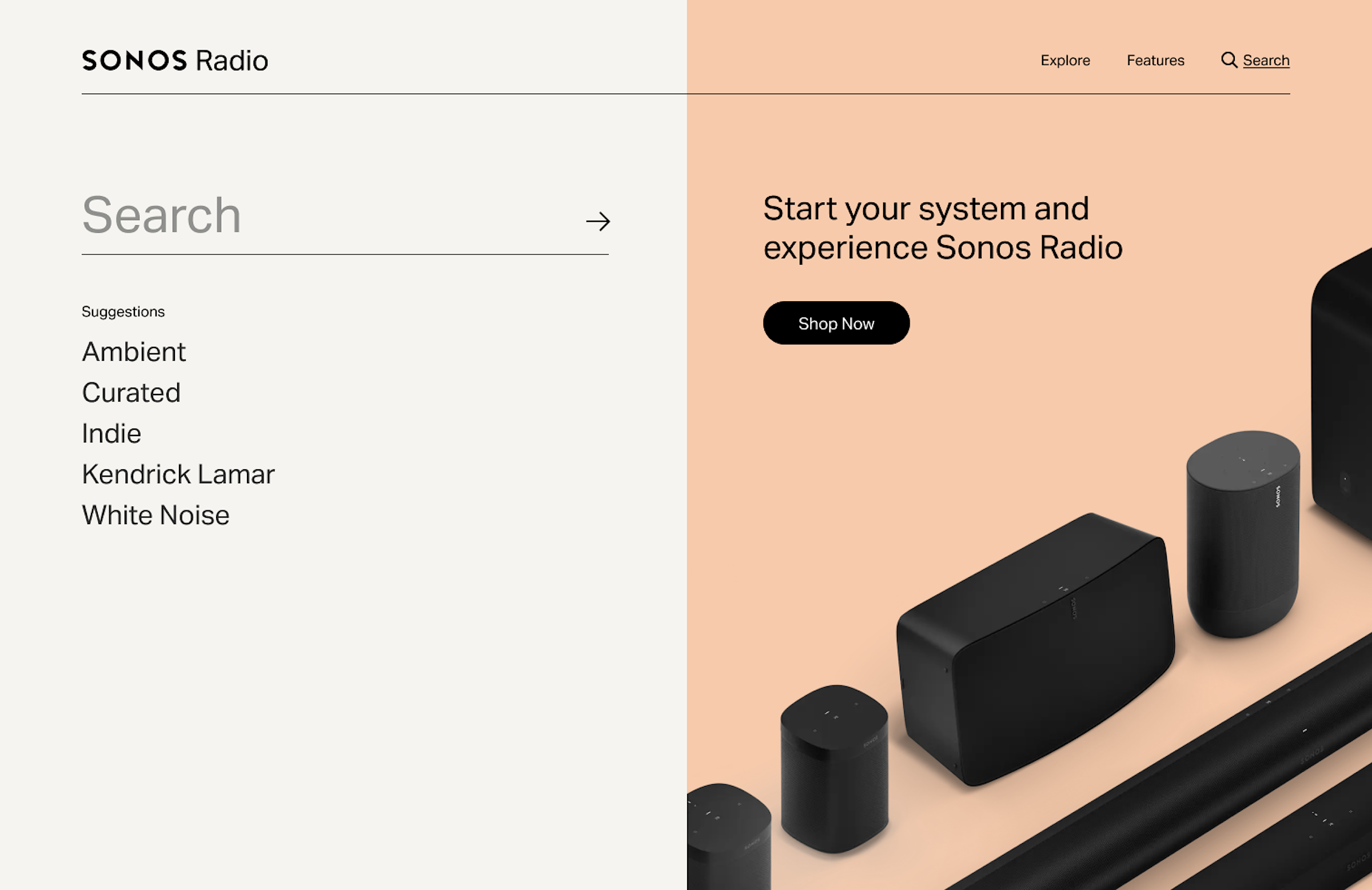
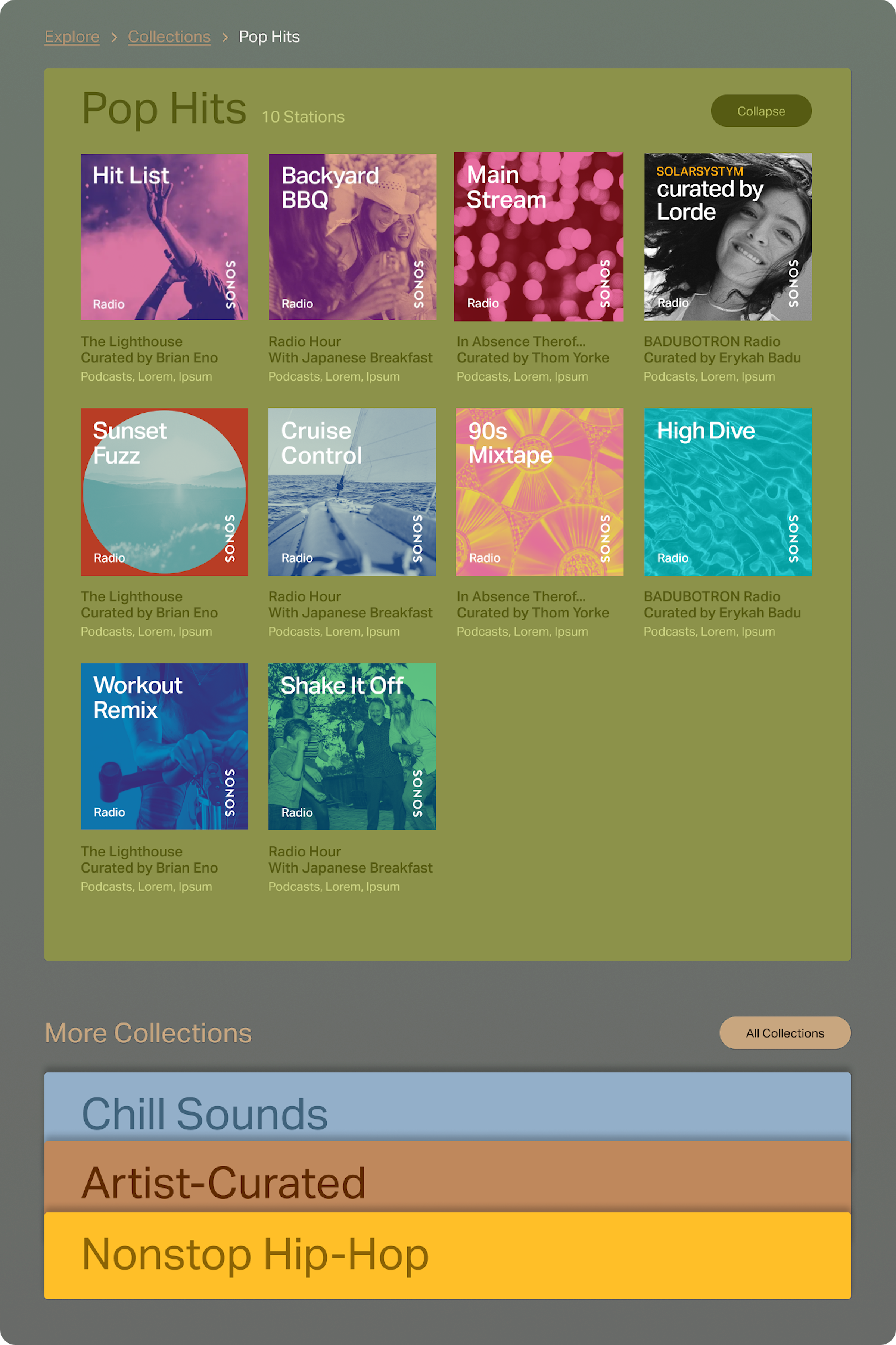
A functional search page that filters shows and stations through relevance and offers a filtered search of shows, stations, and environments for further discovery.

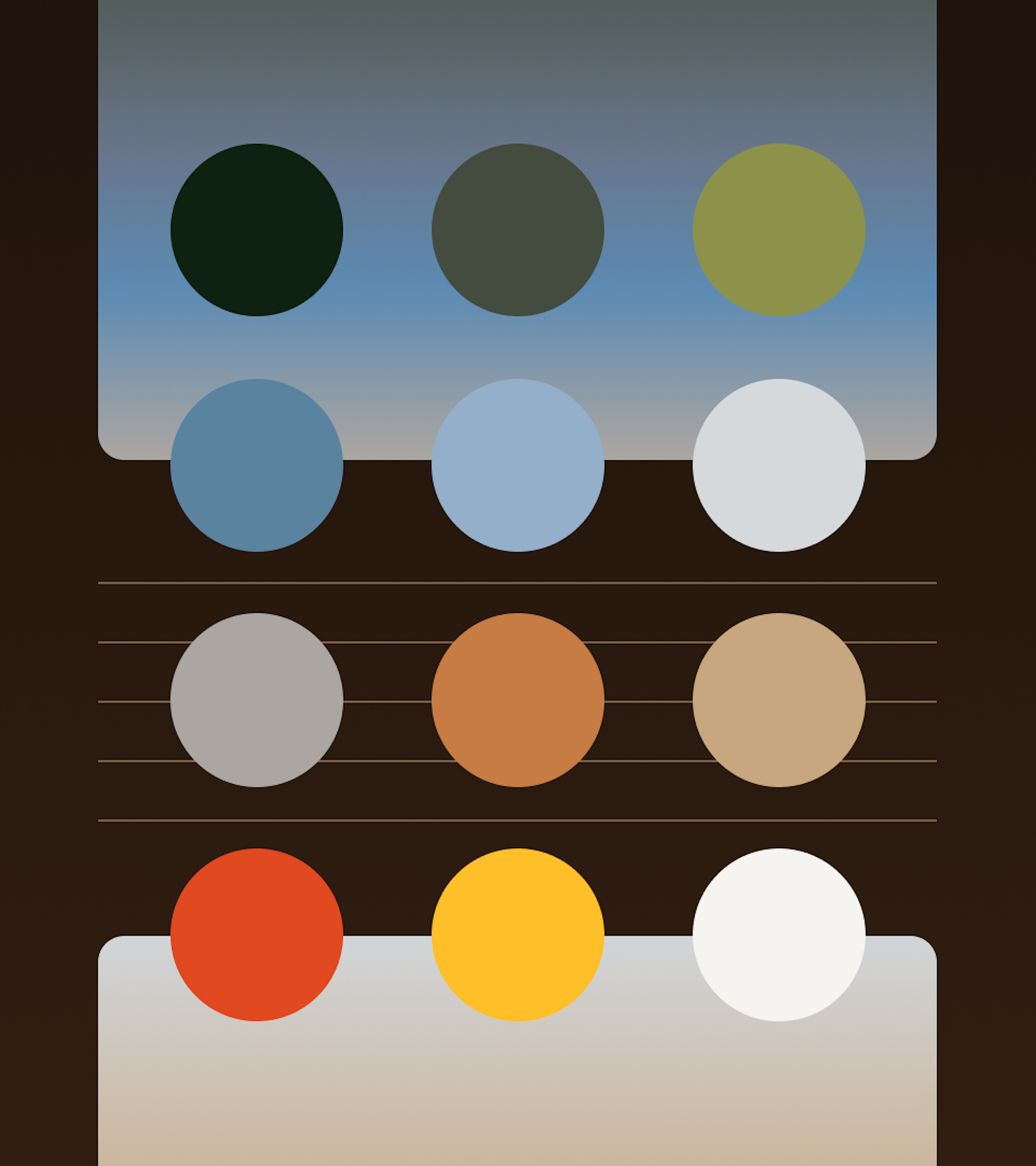
An original design featured a wave of twelve colors that embraced the genre buttons. Upon further discovery, we adjusted the rows to be more readable and introduced the Sonos muted grayscale to stay on brand.