
Parce Rum
Premise
As a small batch, hand-crafted rum from Colombia, Parce seeks to generate awareness and loyalty among fans of fine liquor. To stay true to all things Parce, we doubled down on its inextricable link to Colombia and its people—capturing the happiness they exude as the guiding force for our creation of the brand’s identity.
Partner
Location
Chicago, Illinois and Cartagena, Colombia

Photography by Alex Wallbaum

Fall campaign

Summer campaign

Winter campaign

Spring campaign
Defining a legacy through core attributes
We sharpened Parce’s distinctive qualities with laser-sharp focus. Three pillars for the rum emerged; a commitment to championing modern Colombia, the creation of an ultra-premium product, and a dedication to the human connection that enjoying a cocktail creates. We imbued all work with these values, ranging from custom bottles and brand guidelines to content strategy and production.


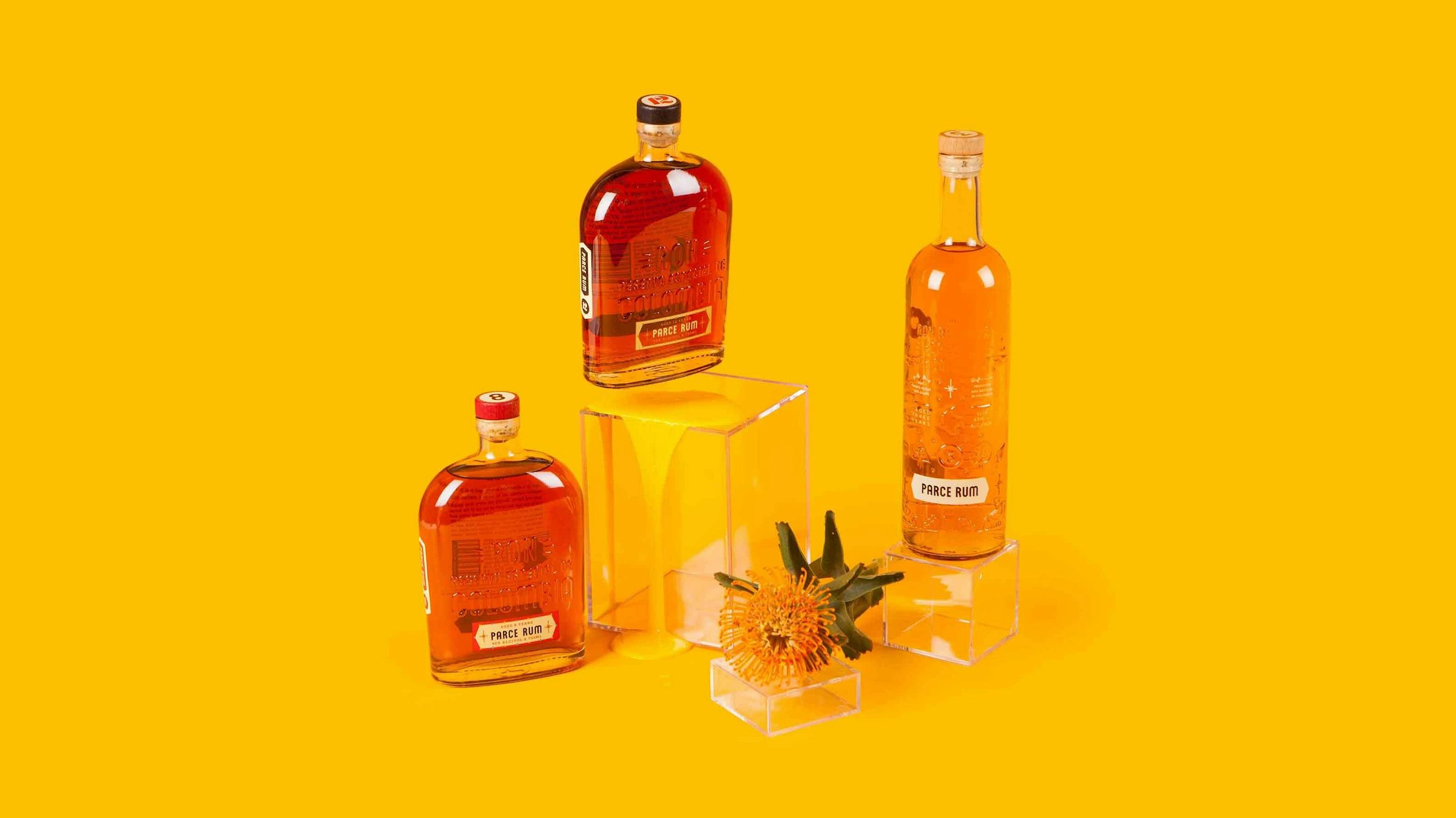
A perfectly aged portfolio
Our creation of Parce’s product line includes an 8 and 12-year aged vintage with an iconic bottle and graphic tops for quick identification. The addition of Brother’s Blend, an entry-level 3-year rum gave the opportunity to break tradition with lighthearted bottle embossments that evoke easy days. Along with it we introduced a sunshine yellow to the sophisticated color palette for a pop.


A custom type to speak volumes
Our creation of the custom typeface, Parcero Neue, provided endless opportunities for the rum to communicate to its drinkers in just a few, bold words. The typeface came to life using base letterforms from the logotype for quick adoption and identification.


Lift your glass, and your spirit
The high-quality, award-winning rum remains humble and focused on the good-hearted nature of a great drink. We created unfussy imagery with playful elements and a voice to match.


I think we’ve met before?
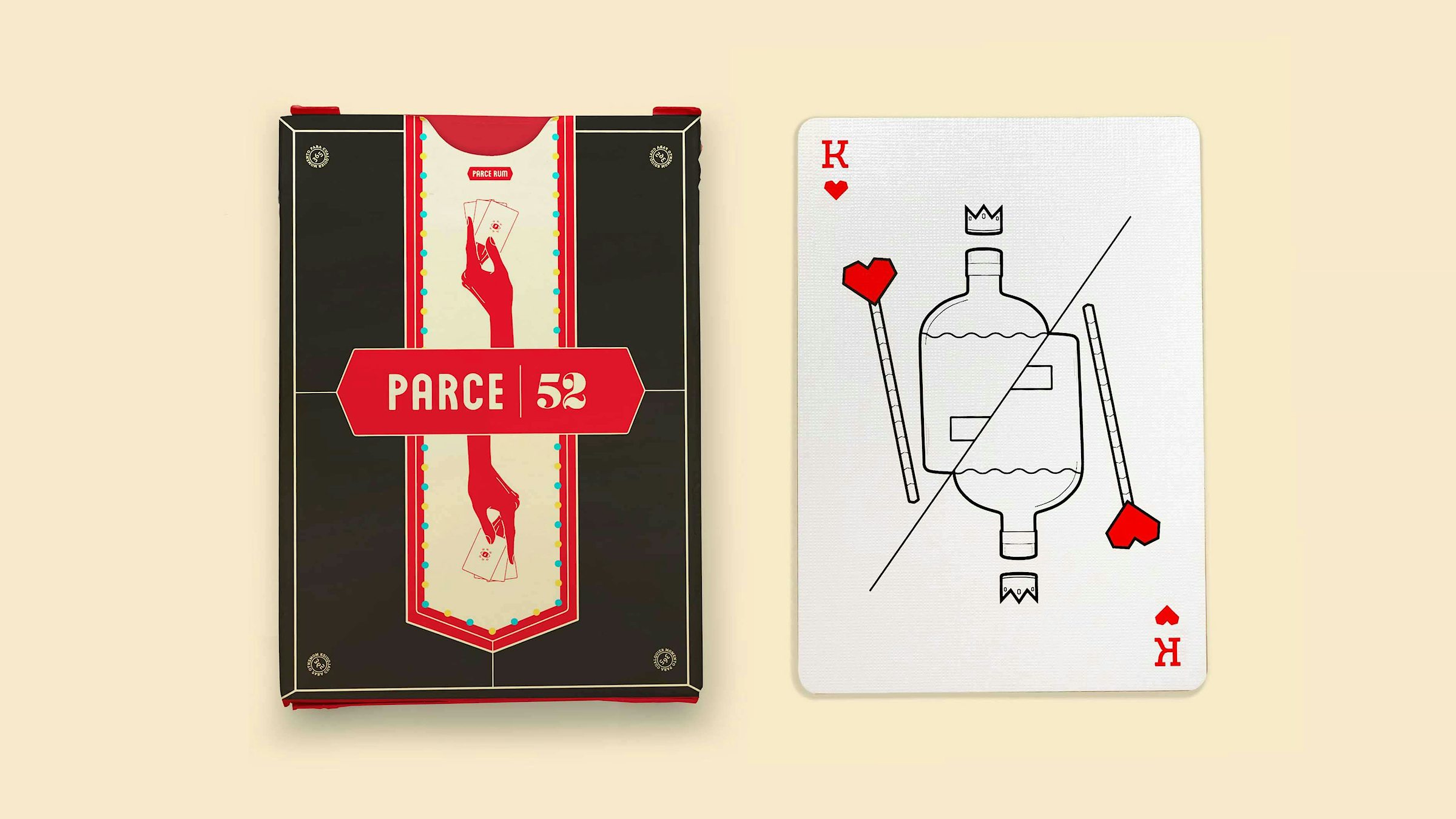
Parce itself means good friend. The brand language is ingrained with the same sense of affable sincerity, like you’ve known it forever. Graphics included custom illustrations whenever possible, drawing on the simplicity of forms to stay grounded.

Illustration style


Instagram stories

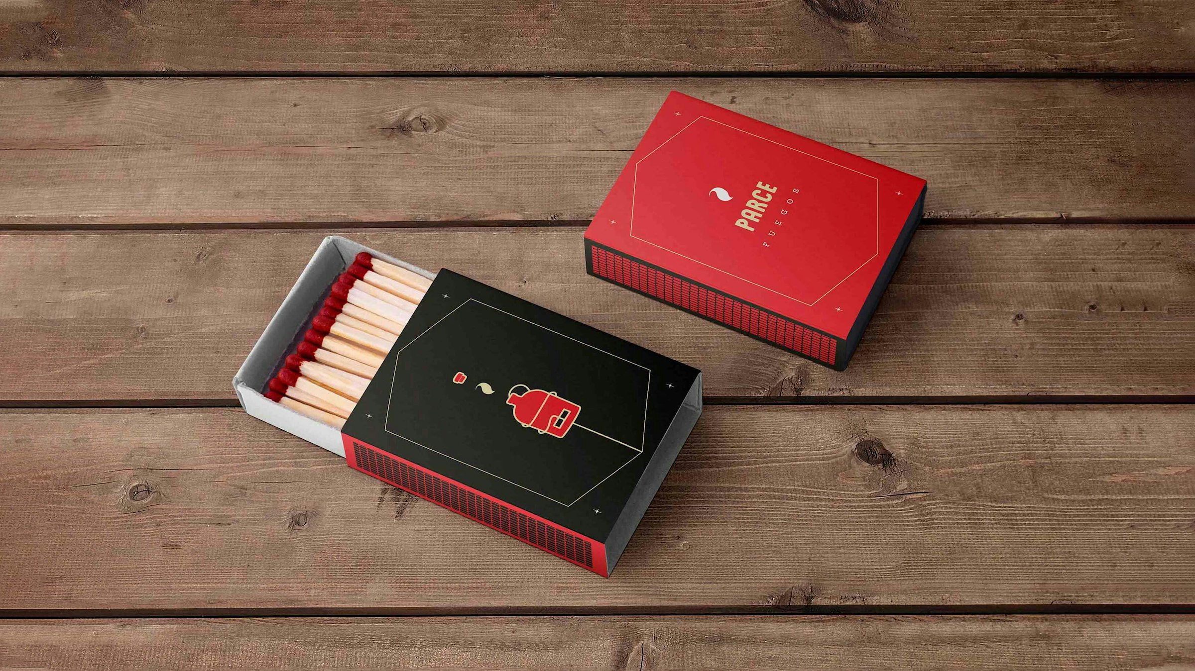
That’s why they call them goods
The Parce Collection was designed and produced as a means for creating meaningful buzz without relying on throw-away marketing too often manufactured without thought. Varyer drove the success of many Parce-intiated projects through strategy and direction, culminating in a fully realized brand with a distinct point of view.


Parce and Foxtrot Delivery Market collaboration


The Parce sticker collection
Who drinks alone, dies alone. Who drinks alone, dies alone.


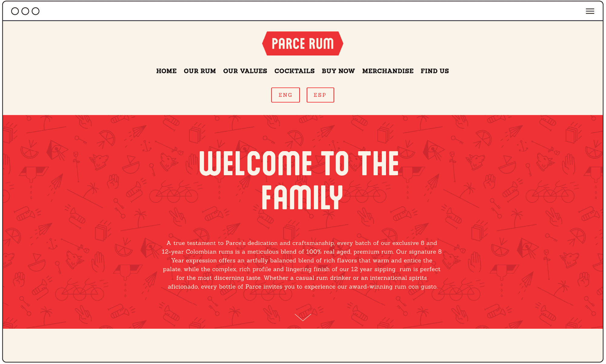
Parce's website, built for easy future upkeep