Forma Collection
Forma Collection
Gallery


The primary Forma Collection wordmark.

Emblems designed for use as a small indication of the Forma Collection presence: social avatars, video bugs, and subscribing buttons.

Common video platform symbols conveyed with the brand's presence—along with the smudges, splotches and doodles we accumulated along the way.

Lina Bo Bardi’s SESC Pompéia.

The window on its own; a tiny glimpse into the performance itself.

The organic shape is only outlined here, but can also serve as its own window into the performance.
Premise
Creating an organic identity that embodies chance and change.
The throughline of our collaboration with Forma Collection was appreciation for improvisation born out of years of experience. Our first conversation with Justin Sergi was about that sense of admiration; his idea was to develop a music platform that featured intimate portraits of classical musicians playing unexpected objects.
Partner
Our initial conversation with Justin was almost like psychoanalysis: we discussed branding a phenomenon and a feeling infused into musical performance, but without artifice or pretension. Our understanding of the project's intention developed the next day, when Justin sent us a sample of what he was proposing.
In the video, a man sits on a couch in front of a coffee table set with plants in vases, candles, and books. He is holding drumsticks and starts riffing a beat on the candle lids, messes up once, smiles, and picks it back up. He then proceeds to develop the beat with a serious face, absorbing the new sounds and emitting them again with precision. In a different scene we see him walk to a staircase and play the railings, then we’re transported into a stage where that same man is playing steel drums beautifully. He’s a virtuoso percussionist and classical composer, and we just saw him apply his talents just as well to a pair of candles and a piece of fused iron.
We did a branding exercise and worked on naming close with Justin, he suggested Forma as a nod to how musicians handle form, a major factor in all the videos he’s producing. In these early stages, Justin identified one of our moodboards, Taxonomy of Sounds, as his preferred path forward. This approach combined a biological approach with the concept of a musical catalogue. Inspirations for this particular design direction were biology books: the experience of curating, and cataloging, trying to understand something intimately and to distill a sentiment. The documentary films of Ila Bêka and Louis Lemoine and the music video for “gun-shy” by Grizzly Bear.
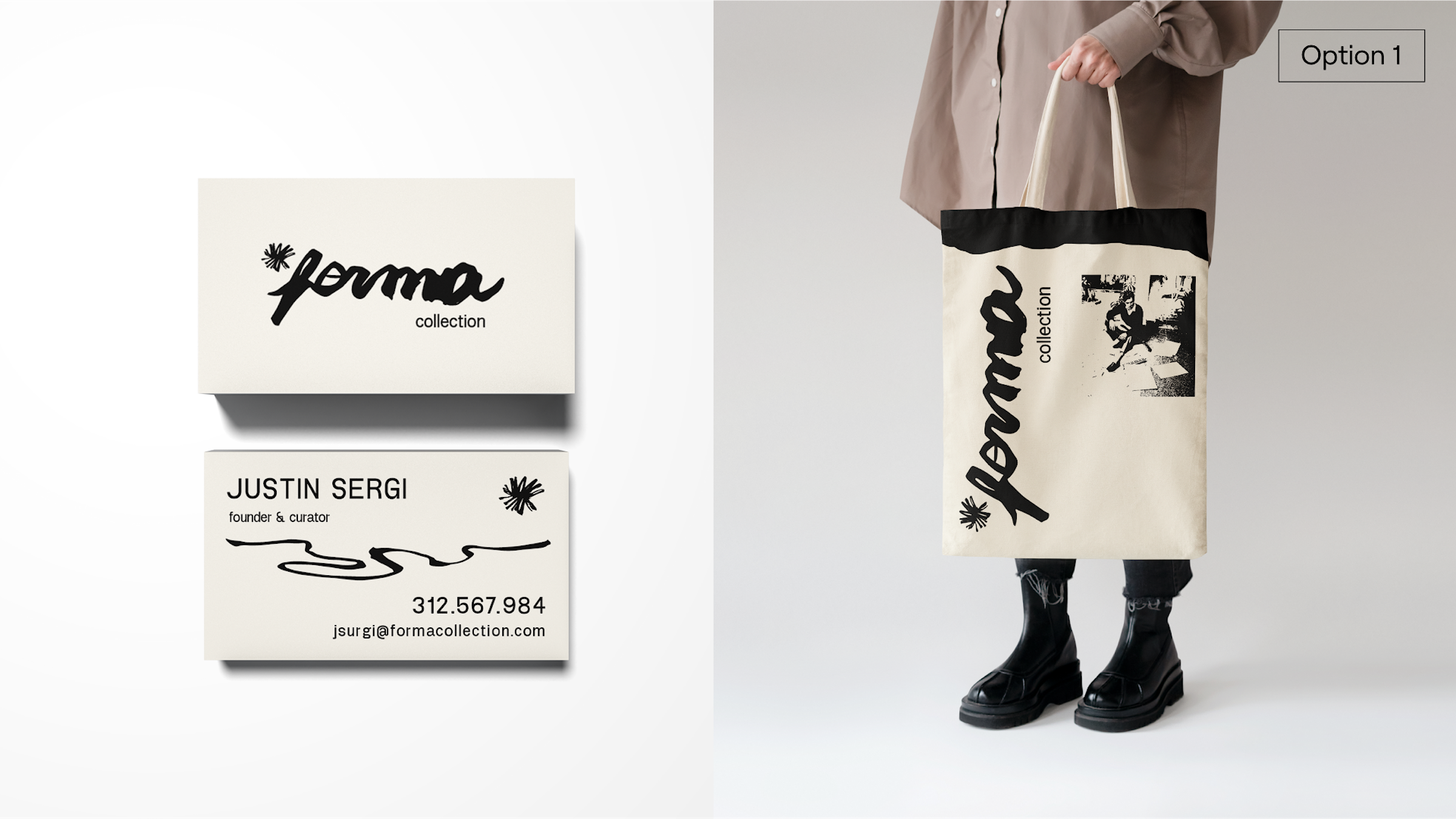
In the first round of design, we dedicated significant effort to designing branding options, considering colors, fonts, arrangements, and symbols. Deviating from this rigorous process, we played with the concept of gestural sumi ink scribbles for a few minutes—just for fun—and wrote a Forma wordmark with the brush. That first iteration of the hand-inked name ended up being the final logo, with a few alterations for legibility.
The primary Forma Collection wordmark.
Emblems designed for use as a small indication of the Forma Collection presence: social avatars, video bugs, and subscribing buttons.
Common video platform symbols conveyed with the brand's presence—along with the smudges, splotches and doodles we accumulated along the way.
Bring people together around the ineffable feeling of witnessing true talent. Bring people together around the ineffable feeling of witnessing true talent.
In the process of collaborating on naming of the project, we worked closely with Justin, who suggested Forma as a nod to how musicians handle form, a major factor in the videos he produced for Forma Collection. While working on early-stage applications of the wordmark, the energetic logo translated well into a variety of real-world applications including shirts, tote bags, and business cards.
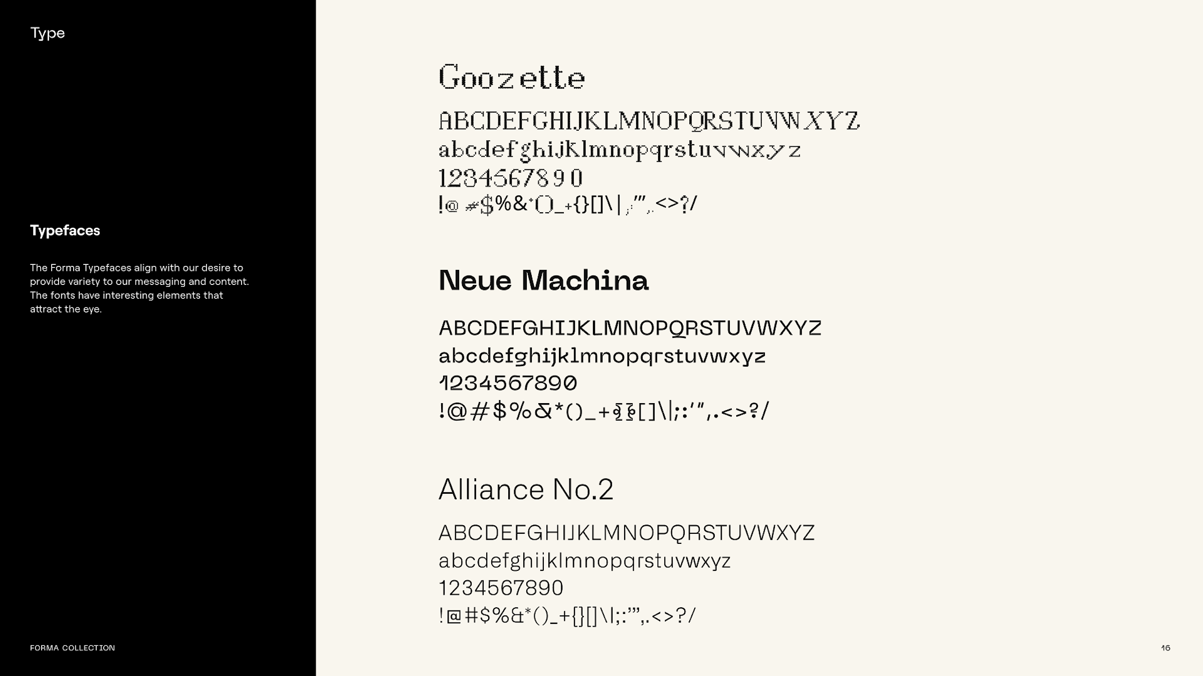
We also added some experimental type and iconography to propel the brand language forward. Justin had introduced us to Steve Reich’s Music for 18 Musicians, and talked to us about his part in experimental music notation. That was the inspiration for creating the marker pixelated icons by hand and the choice of Goozette as a font for the brand.

After experimenting further with the organic forms of the brand, we introduced the concept of graphic elements as windows into Forma Collection's world. In this second branding round, we introduced the concept of Lina’s windows, inspired by Lina Bo Bardi’s puncturing of concrete for the SESC Pompéia building. Even though this direction wasn’t ultimately chosen, Lina’s windows remained as part of the Forma visual communication.
Lina Bo Bardi’s SESC Pompéia.
The window on its own; a tiny glimpse into the performance itself.
The organic shape is only outlined here, but can also serve as its own window into the performance.